Grape Greek Vineyards
A Refresh on a Classic Brand
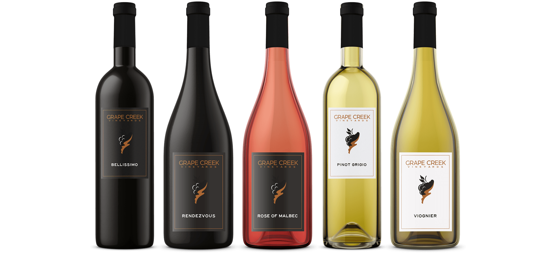
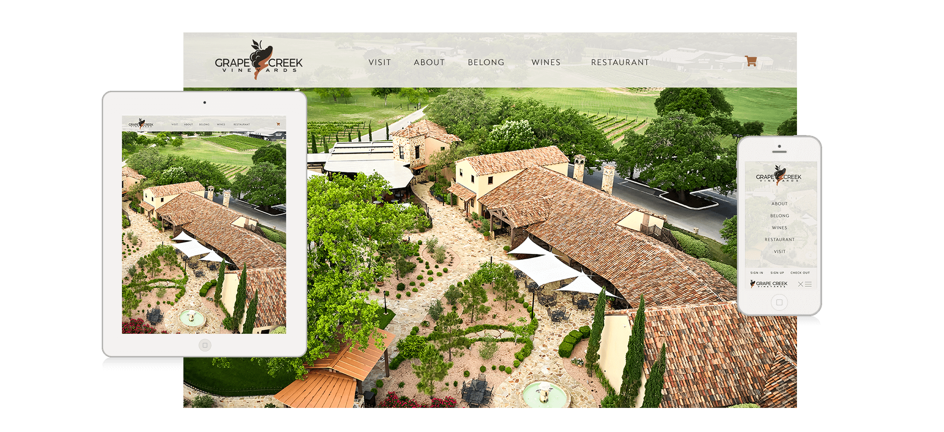
After working with Grape Creek Vineyards for over 5 years and created numerous websites and marketing projects, when it came time to refresh their most recognizable brand, Heath Family Wineries chose 50 Foot update and refresh the brand. With the goal of updating and simplifying, we helped create new brand guidelines that included new color palette, refreshed logo, new labels, and new website. We also were tasked to them implement this brand across all aspects of Grape Creek Vineyards, from mass e-mails to signage.
A well loved brand, when it came time to update an already wonderful emblem, 50 Foot made subtle adjustments for easier use, as well as a more modern touch. With these subtle changes, one can tell the difference side by side, but not on its own, leaving consumers with the sense of brand comfort, while still refreshing to the eyes. The Y was made to fit inside the "creek" and the overall structure was cleaned and slimmed.
Color palettes are reminiscent of the previous brand but modernized for todays trends. The gradient was removed for clean styling and ease of use when ordering products and merchandise.
New fonts were chosen for the logo that are modern and easier to read, reflecting the new style of the redone restaurant and tasting rooms, while still familiar to their fans. Brand fonts also follow this simple style while still incorporating previous fonts when needed for visual impact.
Follow US
Get Big Ideas